Ultimate Gaming
When I got to Ultimate Gaming their branding was a bit outdated. Everyone in the creative department knew it but they just didn't have the resources to churn out new branding while still handling day-to-day tasks. I ended up reworking it in my free time between projects.
After months of ideation and iteration, this is what was eventually settled on as the future branding of Ultimate Poker. It was a long and arduous journey to get to this point and none of the design decisions were made without serious consideration.
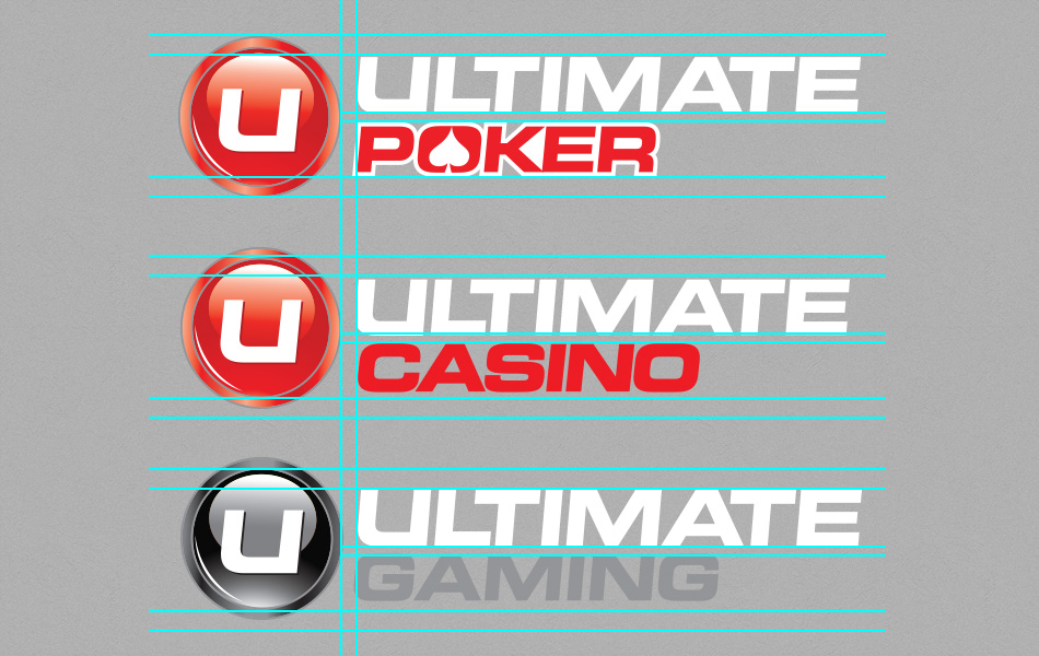
This was the starting point. These logos were created by 3 different designers at 3 different periods in time. At a glance they slightly resemble each other, but looking closely there are quite a few flaws. The disc is too large making it awkward to lockup text with. It's also spaced out more or less from the product name in each version. There is a white stroke and an ace in the negative space of the letter O found only in the poker logo. The text is also slightly different in scale in each.
Although focus was initially placed on just the poker branding, it very quickly became apparent that all the branding needed to be brought inline with each other to better represent each product as part of a suite of offerings rather than an entity by itself.
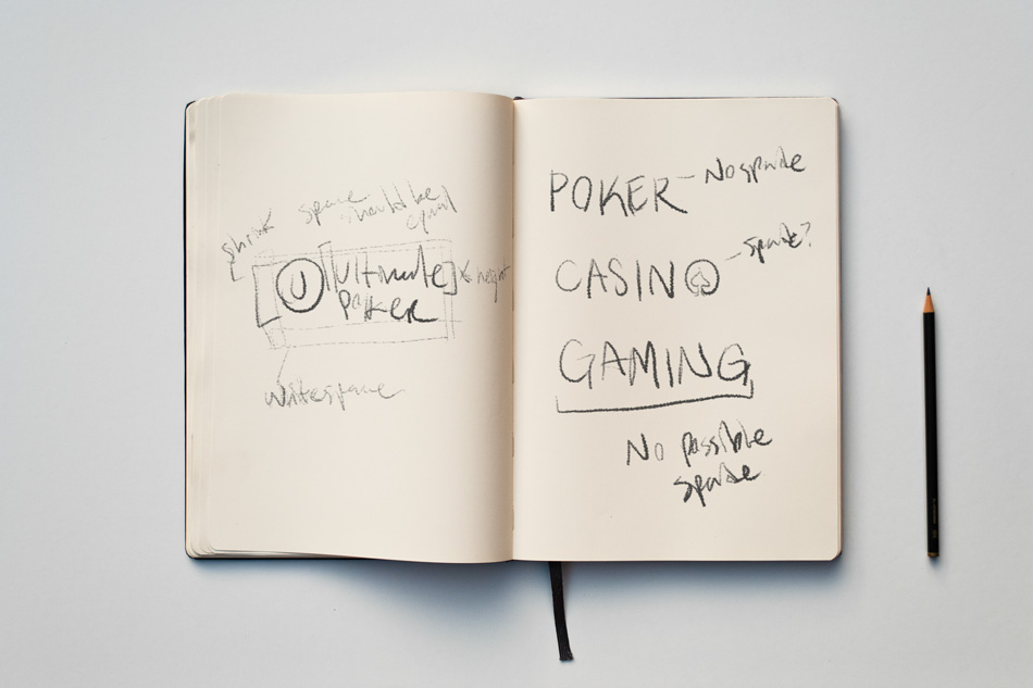
Hundreds of sketches much like these were put together in notebooks, on whiteboards, on desks, on post-its. Anywhere inspiration struck or a conversation was had that revealed a small breakthrough in creating a uniform look.
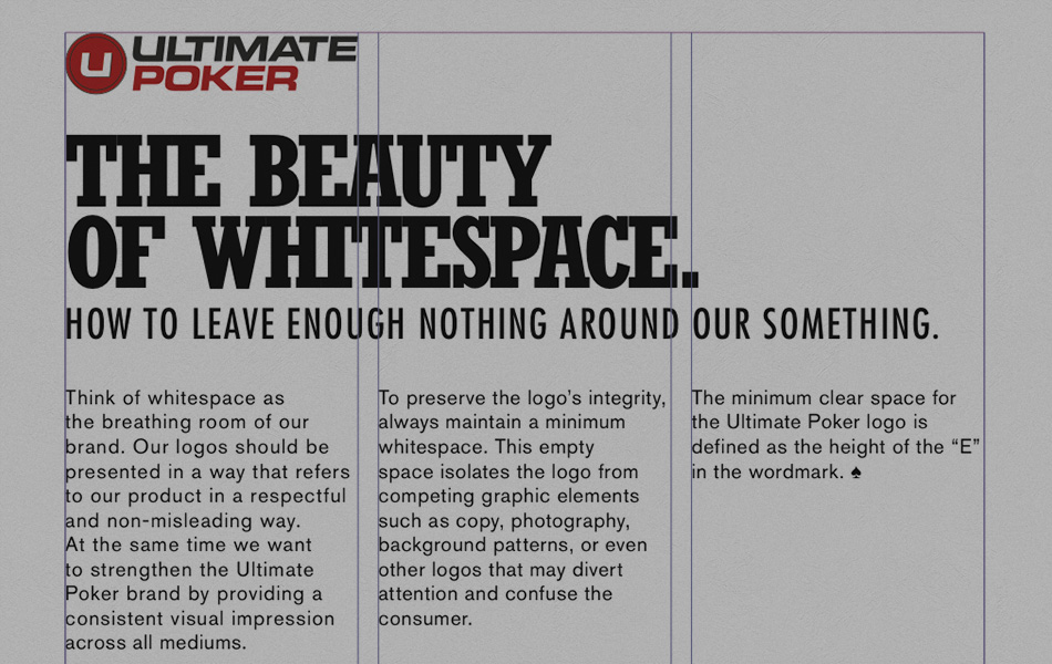
Here you can see the importance of whitespace being stressed as well as some early stage logos. The gradients have been removed but the colors have remained largely intact.
Ultimate had 9 versions of each of the 3 brands logos. That's 18 logos to maintain! That was eventually trimmed down to just the horizontal logo to ease confusion among third party designers when using our assets and reinforce brand recognition in the wild.
Finally a clean, consistent look across all products offered by Ultimate Gaming. Unfortunately this only addresses the look of the logo. Next up was type.
Type is one of the most overlooked parts of a brand. The typefaces used say a lot about the company. People associate different fonts with different attitudes and mindsets. Ultimate didn't have a standard set of fonts they used to represent the company. Only Rockwell was used consistently.
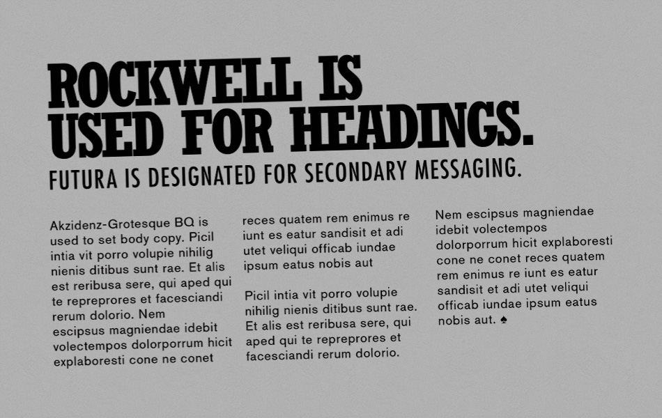
The perfect pairing turned out to be Futura STD and a Condensed version of Rockwell.
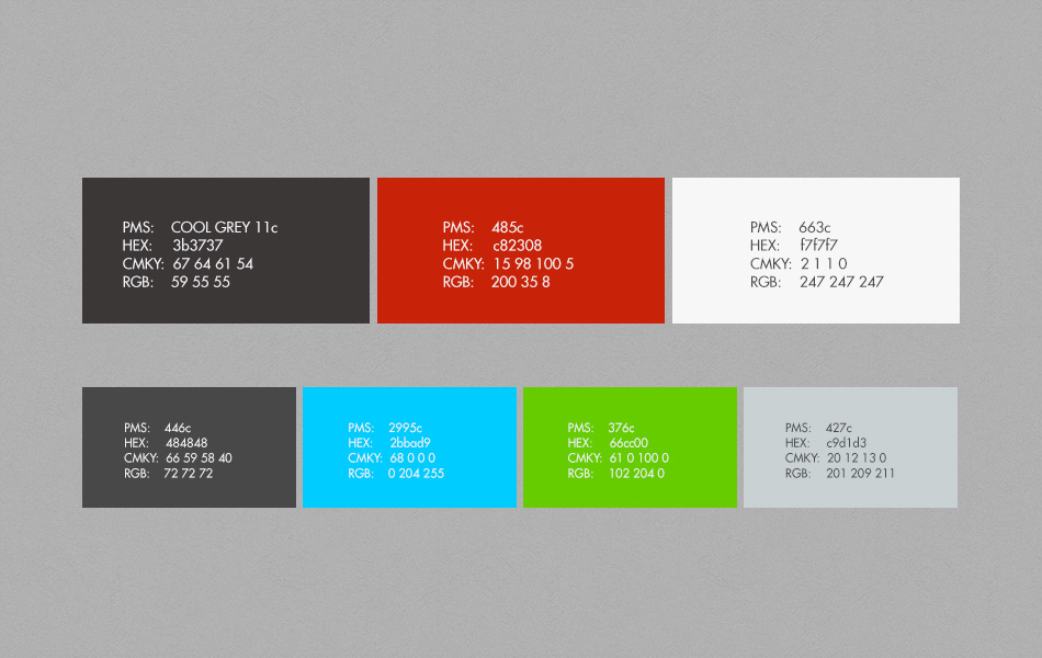
Something Ultimate didn't have at all before was a primary and secondary color palette. Obviously one had to be created. Certain colors were given certain roles. For instance, grey and black and white would be used for most everything while red would be used to draw attention to actionable items.

The original Creative Director had wanted to create a style reminiscent of high-end sports photography. The style that was created for this new set of guidelines was similar, but more muted.
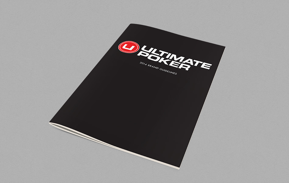
You can download the brand guidelines if you're interested.